Right at the time when markets were making new highs recently I mused whether this rally was based on hot air. I wanted to follow-up on this assessment in light of the recent small pullback and provide an update of some of the technical signals. The bottom line: The technical evidence appears to build on the “hot air” message and suggests that new highs may have been a fake out.
I’ve long outlined my fundamental and structural concerns about financial markets and I won’t rehash them here, but you can read all about them in the Market Analysis section.
One of the most fascinating aspects of market psychology is participants’ tendency to get bullish at new highs while folks like myself, who are voicing concerns, get often dismissed or even outright ridiculed. That’s actually fine by me, after all seeing headlines like the ones below is often the best recipe for a nice contrarian trade set-up:
Why is that so? Because in recent years every major rally, especially those producing new highs, have set up for a sizable trade to the short side. This much is self evident:
And each time new highs were made notable concerns have sprung up that suggested a fading opportunity.
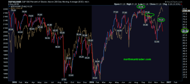
One of the big technical red flags over the past few years has been weak internal participation. Particularly during the May 2015 highs we noted weakening internal structures that ultimately cumulated in the August 2015 down move. The correction in January and February was no exception.
It is true that ever expanding global central bank intervention has continued to bring price back from the brink after each small correction and even now the latest rally has been brought about by promises of tax cuts, stimulus, etc.
But here again we can note an incredible bifurcation that raises red flags. Most notably most of the gains have really come from financials stocks. Indeed 50% of the $DJIA’s recent gain has come from 2 stocks only: $GS and $JPM. Talk about a thin rally.
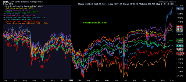
And if you look at the broader index picture, including the international one, the rally in financials stands out like a sore thumb:
Since those May 2015 highs some of the indices have made marginal new highs, but take out the financial rally and things don’t look all that bright, indeed the global picture, despite record central bank intervention, looks highly unimpressive:
But just a few days ago the Nasdaq made new all time highs so what’s the problem? Well, the problem is that just a few days later the $COMPQ dropped back to July 2015 highs. That’s an effective return of 0% over the course of almost 17 months:
Note also the potential structure of an expanding megaphone that the recent highs have brought about.
The reason this is of particular interest: This summer’s new highs were driven by technology, specifically the high cap tech players that control most of the market cap of the index. While some call this sector rotation I see it as money desperate for yield chasing whatever is popular at any given moment, a tale of headlines full of sound and fury, signifying nothing.
Indeed what did the summer high tech fliers just do? They printed a lower high in context of a potential larger topping formation:
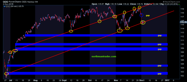
None of this is confirmed until a neckline break but you can see how technically the $QQQ has been trading along 2 trend lines:
Very precise. And the amount of open gaps to the downside raises red flags about how long price can avoid filling these gaps. Hence watching the supporting trend line that was tagged last week should be on the watchlist of any trader.
So what’s going on in tech?
Here’s a look at some of the key components:
$AAPL: Hasn’t made new highs in a long time, has broken multiple trend lines and has not been able to take advantage of the Samsung disaster this summer. RSI and MACD appear weak and is barely trading above the monthly 25MA:
$AMZN: Steady new highs for years, but here too we can observe negative divergences:
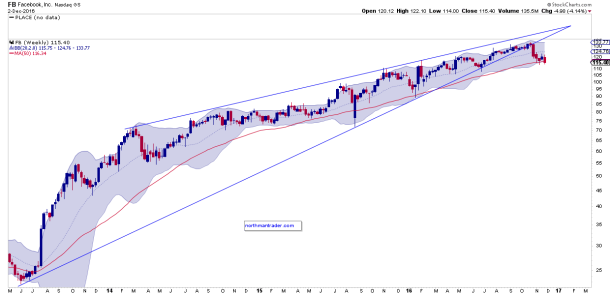
$FB: Trading below its weekly 50MA after recently breaking its wedge pattern, the one I highlighted as a risk factor back in September in Time to get Real III:
$GOOGL remains in its wedge pattern, however it also shows multiple negative divergences and is trading at the cusp of major support:
$MSFT has been one of the strongest tech stocks, but it too raises technical concerns about the viability of the 2016 advance:
If this structure looks familiar it indeed does as seen on a linear chart:
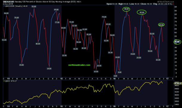
So what’s the underlying message? The underlying picture is not as bullish as the headlines make them out to be:
And the picture is similar on the $SPX:
During the summer highs people were screaming bullish because advance/decliners made a new all time highs. Our indicators suggested that this was a fake out as well. And now following the subsequent low/rally following the election $NYAD has not resulted in new highs, but rather also put in a negative divergence:
In a world of shifting narratives nobody is mentioning advance/decline anymore, so I figured I’ll point it out.
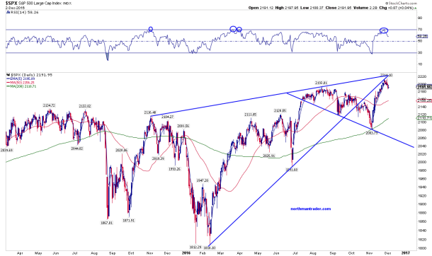
For now we can observe $SPX made new highs, but has stayed below the February trend line and has fallen below the summer highs:
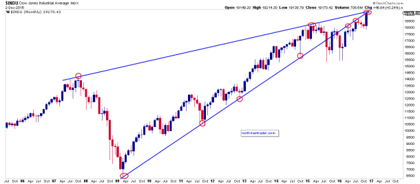
And as strong as the $DJIA has been, driven by a couple of stocks, it just tagged its 2009 trend line on the linear chart:
So while the headlines scream new highs and bullish messages, the underlying picture suggests caution as stocks continue to rally on pure multiple expansion:
This recent rally has been deemed the Trump rally on his promise that he will make America great again. So far, with talks of tax cuts and deregulation, he has made the banks great again which have put in a multi-year performance in just a matter of days since the election:
The premise: Donald Trump will deliver on all the promises he has made and nothing bad will happen.
Really?
We shall see. For now December traditionally has a Santa Claus rally in it following some seasonal weakness into the middle of the month. It has also been suggested that many people may look to want to defer stock selling due to the promise of tax cuts in 2017. And besides, underperforming funds need to chase performance. Are those really good reasons to buy an already expensive market? It wasn’t in December of 2015 as January’s correction showed. But maybe it’s different this time.
The structural pattern continues to suggest risk into the 1622-1750 zone when/if the support trend line breaks as this 2009 rally remains technically uncorrected:
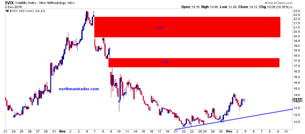
Finally, as to the $VIX, as I suggested on November 24, it remains way too low and continues to call for a filling of upper gaps to come. One gap has now been filled. Two to go:
Such gap fills, when they occur, suggest a bounce in markets to come at that time, but participants may not want to lose sight of the larger $VXO picture:
It suggests there will be a move into the red zone during 2017 at the latest.
While I see potential technical upside risk into 2235-2275 on the $SPX the underlying picture continues to suggest what it has in the past several years: Selling strength especially in context of new highs and low $VIX readings.
Bottomline: The downside risk is much higher than the upside risk in my assessment.
The post Fake Out: A Rally Built On ‘Hot Air’ appeared first on crude-oil.top.


