Submitted by David Stockman via Contra Corner blog,
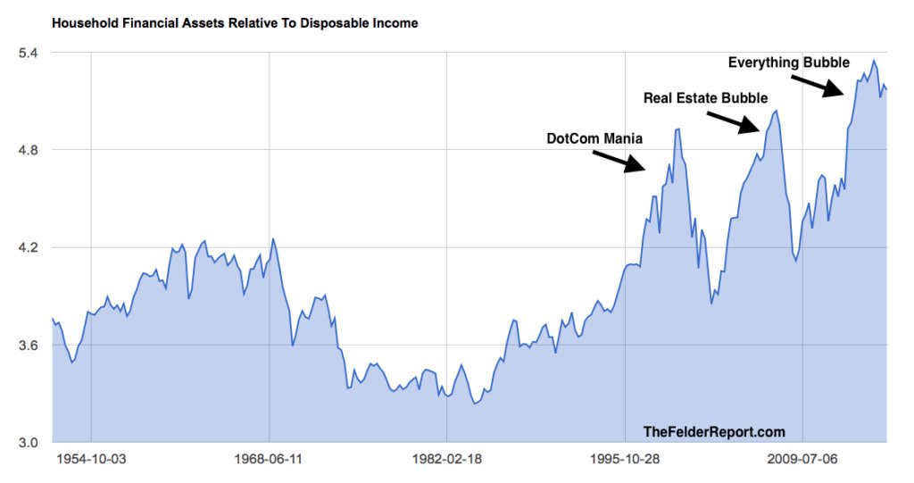
Jesse Felder published an incisive bubble finance chart over the weekend. It is yet another reminder that Janet Yellen and her merry band of money printers are oblivious to the dangerous speculation and valuation excesses that their policies have implanted throughout the financial system.
Relative to disposable income, the value of household financial assets now far exceeds the last two bubble peaks. And that has happened in an economic environment which suggests just the opposite. To wit, valuation multiples and cap rates should be falling owing the fact that the productivity and growth capacity of the US economy has been heading south ever since the turn of the century.
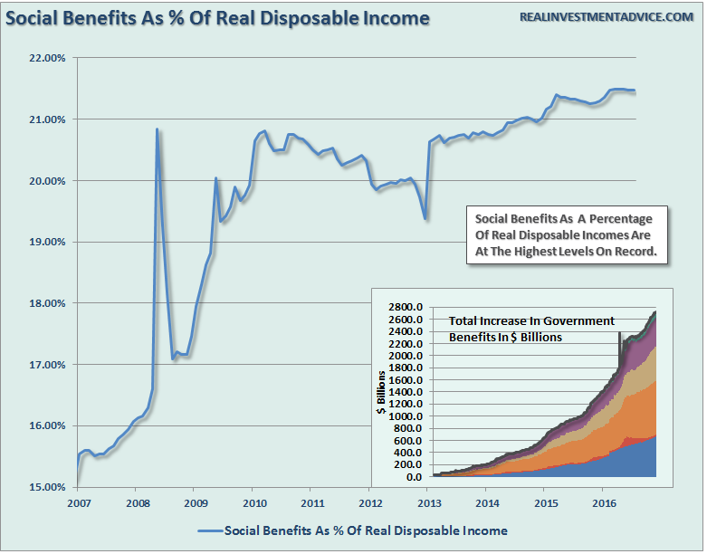
What is even more striking about this chart is what’s hidden behind the denominator. Since the eve of the financial crisis in 2007, a rapidly increasing share of DPI (disposable personal income) has been accounted for by the explosive growth of transfer payments.
Needless to say, transfer payments do not represent newly produced income that can be capitalized into the value of aggregate societal wealth. By definition, transfer payments are extracted via taxation from the incomes of current producers—–or via taxation of future incomes if they are funded with increased government debt.
Either way, the true extent of the bubble excess in Felder’s chart is even more extreme than pictured above. Between 2007 and 2016, in fact, the value of household financial assets soared from $53 trillion to $72 trillion at a time when real personal income excluding transfer payments rose by only 1.2% annually.
And that’s crediting the BLS’ deeply understated inflation indices. In the real world of Flyover America, inflation-adjusted earned income hardly grew at all.
So here’s a newsflash for the clueless school marm who presides over the Wall Street casino. There is no such thing as a timeless “historical norm” when its comes to the valuation of financial assets. The appropriate capitalization rate for a current stream of income or cash flows depends upon the expected growth path into the distant future.
“I would not say that asset valuations are out of line with historical norms.” — Federal Reserve Chairwoman Janet Yellen 9/21/2016
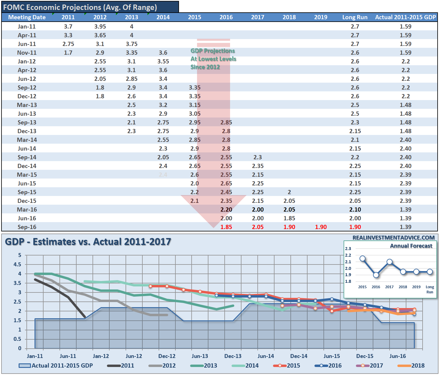
Yet by the Fed’s own reckoning, the expected growth rate of the US economy has been marked down time and again in its economic forecasts. The long-run median real GDP growth rate is now pegged at just 1.9%.
So you might think someone on the fed would connect the dots. For the last six years running, they have drastically over-estimated the growth of real GDP even as the stock indices have soared based largely on multiple expansion.
Thus, after estimating 3.7% growth in 2011 and nearly 4.0% growth in 2012, actual expansion came in at 1.7% and 1.8%, respectively. Yet that wasn’t some kind of temporary aberration. During 2013 and 2014, the shortfall between initial estimates and actual was also nearly 50%; and then, even as the Fed lowered its estimates for 2015 and 2016, the actual rate of growth slowed still more.
In the case of anyone paying attention, of course, the tepid and weakening recovery conveyed in the table below helps explain why S&P 500 profits peaked six quarters ago in the September 2014 LTM period at $106 per share. Since they came in 19% lower at $87 per share in the June 2016 LTM, the actual market multiple at 24.7X is anything but normal, and that’s hardly a temporary condition, either.
As was indicated in a nearby post, the Wall Street hockey stick is bending toward the flat-line yet again. The most recent earnings outlook for Q3 has turned negative on a Y/Y basis—just in time for the next earnings season, and also precisely as needed for another round of Wall Street’s phony earnings “beat” game.
In short, in the context of declining earnings, PE multiples are not even in line with historic norms. Contrary to Yellen’s press conference blather, they are at the very top of the charts.
Worse still, the Fed continues to project that interest rates will “normalize” back to 3% on the federal funds rate and 4.2% on the 10-year treasury note. And in point of fact, sooner or later that must happen or the entire monetary system will be destroyed.
So with a future outlook characterized by slowing growth, weakened earnings and rising interest rates, how in the world can it be said that current valuations are nothing to worry about?
At the same time, even the Fed’s new dissenter, the formerly dovish, Eric Rosengren, remains lost in the Fed’s Keynesian puzzle palace. Rosengren voted to raise interest rates because he apparently thinks the US is nearing full employment, and that it may overshoot by 2019, thereby creating inflationary risks:
By 2019, I expect the unemployment rate to have declined below 4.5 percent. While I have a long track record of advocating for policy that supports robust labor market conditions, that is below the rate that I believe is sustainable in the long run.
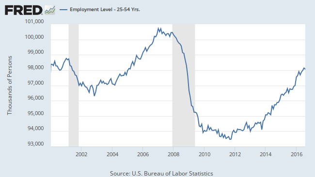
Well, that’s some kind of “full-employment”. There are 5 million more prime working age persons in the US today than there were in January 2000, but the number with “jobs”, including part-time gigs a few hours per weak and self-employed e-Bay traders, is nearly 1.0 million lower!
As for inflation, here is another newsflash. It’s already here.

So here’s the danger. The denizens of the Eccles Building see no bubbles in a financial system that is rampant with asset inflation. It sees full-employment when the US economy has more labor slack than any time in modern history. And it keeps the Wall Street gamblers in free carry trade funding because it wants even more inflation than what is already ravaging the real incomes of Flyover America.
No wonder the Trump voters want to throw the bums out. It is none too soon.


The post Dangerous Bubbles In Plain Sight appeared first on crude-oil.top.